

Photo by Eric Nopanen on Unsplash
How to Build a Podcast Player With React Js, Tailwind CSS and Apple Podcast API


Table of contents
- This article will cover all the steps and code needed to build a podcast player with React, TailwindCSS, and Apples' podcast API. It is a long one broken into five parts. I hope you are ready to dive in.
- Introduction
- Our approach
- Setting up the React project and files
- Building the application layout
- Creating the skeleton of the application layout
- 💡 Checkpoint 1
- Other parts of the tutorial
This article will cover all the steps and code needed to build a podcast player with React, TailwindCSS, and Apples' podcast API. It is a long one broken into five parts. I hope you are ready to dive in.
Live code demo on Code Sand Box
Introduction
React is a user interface framework developed by Facebook. It allows developers to build intuitive websites with rich user interactivity using HTML-like syntax. It also allows modularity, which means you can break code down into manageable modules that makes maintenance of your website or application easy to maintain.
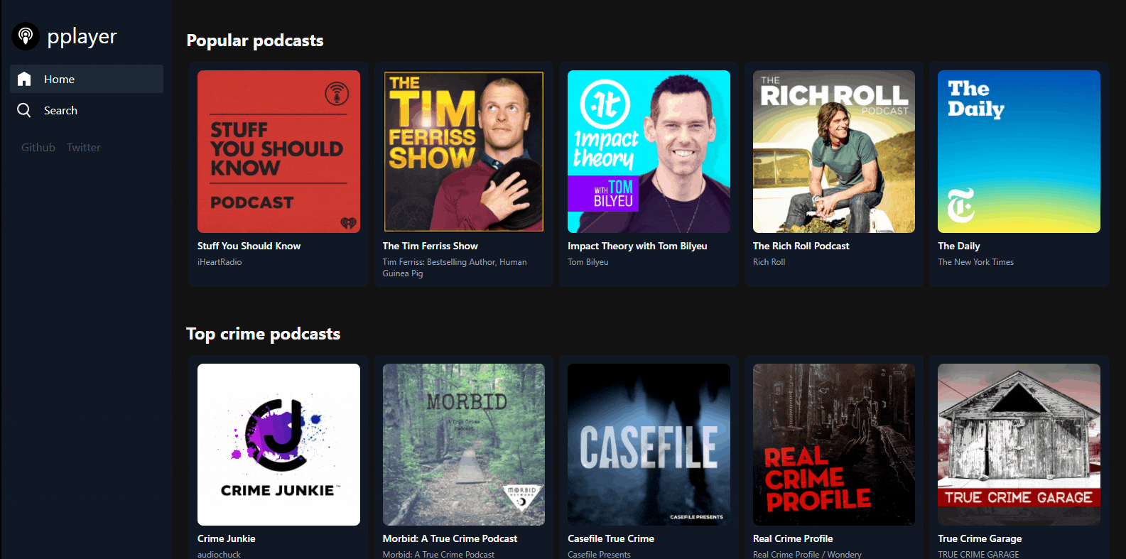
In this tutorial, you are going to build a podcast application using React and Apple Podcast API. The application will allow users to browse through all the podcasts available on Apple. When users visit our deployed site, they can choose to listen to the top podcast of the day or use the search functionality that you will develop to search for any podcast of their choice available on Apple Podcast.
I chose Apple API because it offers a free API with few limitations. While experimenting with the API, I didn't hit the APIs rate limit despite some heavy reloading during the application development. I found that other podcast APIs required creating an account, and they had limited access to their free plans. Meanwhile, with Apple API, you don't need to log in or provide any details, the limits are generous, and no token is required to send requests.
Other parts of the tutorial
📘 How to Build a Podcast Player With React Js part 1
📘 How to Build a Podcast Player With React Js part 2
📘 How to Build a Podcast Player With React Js part 3
📘 How to Build a Podcast Player With React Js part 4
📘 How to Build a Podcast Player With React Js part 5
Who this tutorial is for
This tutorial is for intermediate developers, developers who have built a few apps with React and are looking for a comprehensive introduction to some advanced features like debouncing, lazy loading, redux (state management), routing, and loading pages dynamically. Newbies can follow along but note that we glazed over details in some parts, including the CSS.
What you will learn
In this tutorial you will learn:
- API calls with Axios
- Debounce
- React Hooks
- Responsive web design with Tailwind CSS
- Reusable React component
- Using the 'read more' button to hide/show text
- Using JavaScript Audio API to play sounds in the browser
- Apple API
- Infinite scroll, for lazy loading
- App layout with a fixed sidebar that does not change between renders, improving performance
- Postman - Calling Apple API from the browser downloads a file that is hard to analyze, but postman has a "JSON" feature
- Reverse Proxy to prevent CORS Error
- React-Redux
Tools you will need
- A computer with Node installed. You can download Nodejs from nodejs.org. I will advise you to download version 14+.
- NPM, a package manager that helps you pull in the various modules needed for our application.
- A modern code editor. I will recommend visual studio code. It comes with an assortment of extensions to improve the workflow of developers.
- Heroku account and Heroku CLI. Heroku will host a reverse proxy to prevent CORS issues when you deploy the final application. Create a Heroku account if you don't have one. Then install Heroku CLI, you can install it with NPM, but note that it wouldn't auto-update. Other methods are available. How to install and run the reverse proxy will be discussed later in this tutorial. If you skip this section, you might run into CORS issues.
- (Optional) Postman, for exploring API queries and viewing the results in your desired format like JSON.
Our approach

I will start by creating the structure for the significant parts of the project. It will help you focus on functionality down the line. After setting up the project files and folders, I will create the skeleton of the application. Then move on to building the functionalities.
When making changes to files, I will provide the entire code, so you don’t have to worry about the changes and focus on the tutorial.
I will also create checkpoints after each part, including GitHub code and live code through Codesanbox (where applicable) so that you have something to compare your code.
Setting up the React project and files
To start the application, open your command-line tool of choice and run:
npx create-react-app podcast-player
cd podcast-player
yarn start
The first command takes some time to complete because it downloads files and folders for the project.
These commands create the projects' files and folders, change the directory to the just created folder, and then start the application because of the yarn start.
At this point, you should see the famous default React app page in the browser at http//:localhost:3000.
If you want more details on creating a React app, please look at create-react-app website.
Building the application layout
TailwindCSS setup
In this tutorial, I don’t want to take your time to talk about installing Tailwind. And because of the extra work you have to do during deployment. Instead, I will provide all the styles needed for this application in a CSS stylesheet. Note that tailwind generated them. Tailwind employs a tree shaking technique that only adds the CSS classes used in the application when you build the application with yarn build. yarn build runs when you deploy your application to any popular platforms that host React like Heroku, Vercel, or Netlify.
🔗 If you want to install Tailwind for this tutorial, you can find the guide here. However, it is unnecessary for this application.
🔗 This is the link to all the CSS files you need for this project. Click on 'raw' and copy the CSS and overwrite the content of the App.css file in the root folder of the application.
🔗 You can also get the CSS from the GitHub repo of the first checkpoint. Then copy the entire code into the App.css file in the root folder of the application.
Setup pages or screens
React router will handle navigation. React router is a module for React that allows you to navigate our application by mapping URLs to components. It can also take dynamic URLs, as you would see later.
This is the layout of the application:
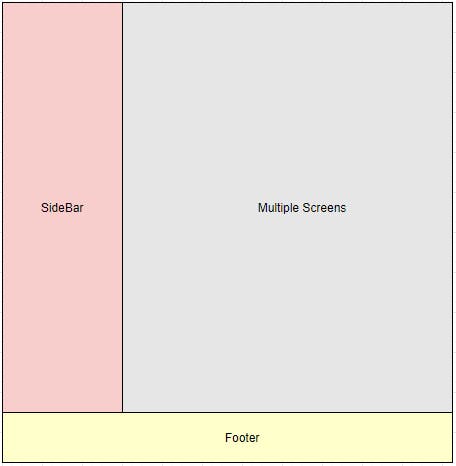
The application will be designed so that the sidebar and the footer will not re-render when the page changes. That means, unlike other apps that apply the React router at the device screen level. Instead, this application will use it inside a div or container in the app. In this case, the div represents ‘Multiple Screens’ in the image above. The same will apply to the ‘SideBar’.
Now run:
yarn add react-router-dom
This installs react-router-dom which is used for navigation.
Taking care of images once and for all 😆
🔗 Download the images used in this project from Dropbox here. Then, click on the download button on the top right to download the images as a zip file and extract it.
🔗 View the first checkpoint here. So that you can copy it into your project.
Create an img folder inside the src folder of the project.
Copy all the images from the image folder you downloaded and paste them into your newly created img folder.
This will ensure that when you flesh out the application, you won't have image related errors.
Suppose you want to change the favicon (the small image by the left of each website name on your browser's address bar) of your site like mine. Replace the favicon.ico file in the public folder with an .ico file of your choice. Mine will be available in the public folder of the final version of the project.
Creating the skeleton of the application layout
Create a screens folder within the src folder.
Add 4 new files namely:
- GenreListScreen.jsx
- HomeScreen.jsx
- PodcastDetailsScreen.jsx
- SearchScreen.jsx
Copy the code below the GenreListScreen.jsx
import React from 'react'

const GenreListScreen = () => {
  return (
    <div>
      <h1 className="text-white">GenreListScreen</h1>
    </div>
  )
}

export default GenreListScreen
The code above creates a functional component and adds a simple white text inside it. So that when the routes are configured, you can verify that navigation to the different screens works. Then the export statement makes the component available to be imported in any file that needs it.
Then repeat the same for the other 3 screen files.
Copy the code below into the HomeScreen.jsx
import React from 'react'

const HomeScreen = () => {
  return (
    <div>
      <h1 className="text-white">HomeScreen</h1>
    </div>
  )
}

export default HomeScreen
Copy the code below into the PodcastDetailsScreen.jsx
import React from 'react'

const PodcastDetailsScreen = () => {
  return (
    <div>
      <h1 className="text-white">PodcastDetailsScreen</h1>
    </div>
  )
}

export default PodcastDetailsScreen
Copy the code below into the SearchScreen.jsx
import React from 'react'

const SearchScreen = () => {
  return (
    <div>
      <h1 className="text-white">SearchScreen</h1>
    </div>
  )
}

export default SearchScreen
Create a components folder.
Add 2 new files namely:
- MobileHeader.jsx
- FooterPlayer.jsx
The MobileHeader will only display on small devices. On small devices, the SideBar disappears. So the application will have a top menu instead of a sidebar on mobile devices.
The FooterPlayer is used to show the podcast that is playing. It is static on the page to change pages without losing the ability to pause the currently playing podcast.
// This component will only show on mobile sized viewports
import React from 'react'
import { Link, NavLink } from 'react-router-dom'

import logo from '../img/logo.svg'
import home_logo from '../img/home_icon.svg'
import search_icon from '../img/search_icon_white.svg'

const MobileHeader = () => {
  return (
    <div className="block md:hidden w-full text-white bg-gray-900">
      <div className="flex flex-row ">
        <div className="flex flex-row py-4">
          <img src={logo} alt='logo' />
          <Link
            className="text-2xl text-white lg:text-3xl hover:text-gray-100"
            to="/">
            pplayer
              </Link>
        </div>
        <div className="text-left pt-3">
          <NavLink
                            className="flex mx-2 my-1 rounded p-2 px-4 hover:bg-gray-800"
                            activeClassName="bg-gray-800" exact to="/">
            <img src={home_logo} alt='home_icon' />
            <span className="ml-4">Home</span>
          </NavLink>
        </div>
        <div className="text-left pt-3">
          <div>
            <NavLink className="flex mx-2 my-1 rounded p-2 px-4 hover:bg-gray-800"
                                            activeClassName="bg-gray-800" exact to="/search">
              <img src={search_icon} alt='search_icon' />
              <span className="ml-4">Search</span>
            </NavLink>
          </div>
        </div>
        <div className="mt-3 flex flex-col">
          <a href="//add link to your github repo"
                            className="mx-2 text-sm text-gray-600 hover:text-gray-500"
                            aria-label="GitHub">
            Github
          </a>

          <a href="//add link to your twitter"
                            className="mx-2 text-sm text-gray-600 hover:text-gray-500"
                aria-label="Twitter">
            Twitter
          </a>
        </div>
      </div>
    </div>
  )
}

export default MobileHeader
Don't be intimidated by the code above. TailwindCSS demands plenty of CSS classes.
Link and NavLink are imported, and Link is react-routers version of your anchor tag in HTML. While NavLink is similar to Link but in addition, it supports an activeClassName attribute that specifies the style of the link when it is active. Then the imported images are placed side-by-side with the navigation links. And an image of the site logo for the homepage link. Remember this is the MobileHeader that is only visible on small-width devices.
The other links with anchor tags are external links for you to link your GitHub and Twitter.
Copy the code below into the FooterPlayer.jsx file.
import React from 'react'

const FooterPlayer = () => {

  return (

    <div
      className="fixed left-0 bottom-0 min-w-full z-10"
      style={{ backgroundColor: "#1a1a1a" }}>
      <div className="relative h-full w-full flex">
      <h1 className="text-white">FooterPlayer</h1>
      </div>
    </div>

  )
}

export default FooterPlayer
This code defines a component that is fixed to the bottom of the page and not much for now.
Next, create a containers folder.
Add the new files namlely:
- MainSection.jsx
- SideBar.jsx
The MainSection file will house all the screens and swap them accordingly when you interact with the application.
Copy the code below into the MainSection.jsx file
import React from 'react'
import {
  Switch,
  Route
} from 'react-router-dom'

import HomeScreen from '../screens/HomeScreen'
import SearchScreen from '../screens/SearchScreen'
import PodcastDetailsScreen from '../screens/PodcastDetailsScreen'
import GenreListScreen from '../screens/GenreListScreen'

const MainSection = () => {
  return (
    <>
      <main className=" player-section pl-0 md:pl-60  min-h-screen min-w-full">
        <Switch>
          <Route exact path="/" component={HomeScreen}></Route>
          <Route exact path="/Search" component={SearchScreen}></Route>
          <Route exact path="/podcast/:collectionId" render={(props) => (<PodcastDetailsScreen {...props} />)} />
          <Route exact path="/genre/:genreId" component={GenreListScreen}></Route>
        </Switch>
      </main>
    </>
  )
}

export default MainSection
The code above imports some modules from the react-router-dom and also all the screen components. Then all the routes are defined within the Switch. As the name implies, the switch swaps the screens according to the URL the user visits.
exact is used on all routes to remove ambiguity. The routes for HomeScreen and Search are static. While the routes for PodcastDetailsScreen and GenreListScreen are dynamic because they have to display the podcasts or genres that the user clicks on. The parts with the colon :collectionId and :genreId will be replaced by ids in the actual URL. And those ids can be passed to the PodcastDetailsScreen and GenreListScreen respectively as parameters or props that will query the API for the specific podcast or genre.
The collectionId is an alias for the podcast id in Apple Podcast API.
The weird-looking render={(props) => (<PodcastDetailsScreen {...props} />)} is used to pass down functions that will be created in another part of this tutorial. This Route will be updated later. One of Reacts' superpowers is passing data and functions seamlessly between parents and children components and vice versa.
Bringing it all together with the App.js file
Overwrite the App.jsx file with the code below:
import React from 'react'
import { BrowserRouter } from 'react-router-dom'

import MainSection from './containers/MainSection'
import SideBar from './containers/SideBar'

import MobileHeader from  './components/MobileHeader'
import FooterPlayer from './components/FooterPlayer'

function App() {
  return (
    <div className="App">
    <BrowserRouter>

    <div>
      <MobileHeader />
      <div className="flex relative">
        <SideBar />
        <MainSection   />
        <FooterPlayer  />
      </div>
    </div>

    </BrowserRouter>
  </div>
  );
}

export default App;
As its name implies, this file represents the entire application. Remember, all the screens were imported into the MainSection.jsx file because they will be Switched inside the MainSection component, while the SideBar and FooterPlayer will remain static on the screen between renders. This is not common practice for most applications, but I chose this style because it is fun, and besides, the SideBar contents don't change.
All routers must be wrapped in the BrowserRouter which has been done here. A typical react-router code looks like this:
// Do not copy this, it is an illustration
<BrowserRouter>
    <Switch>
        <Route ... />
        <Route ... />
        <Route ... />
    </Switch>
</BrowserRouter>
But putting the Switch in a separate file is cleaner.
Run
yarn startin the command line. To see the skeletal representation of the application.March 2022 Update: I noticed an error caused by the logo.svg file on codesandbox. So I updated the code and converted the logo.svg into a JSX component.
To implement this change do the following:
- Copy this GitHub gist.
- Create a
Logo.jsxfile in thecomponentsfolder. - In
components/MobileHeader.jsxreplace line 5 withimport Logo from "./Logo";and line 14 with:<Logo /> - In
containers/Sidebar.jsxreplace line 4 with:import Logo from "../components/Logo";and line 15 with:<Logo />
And that should be all. You can carry on with the tutorial.
💡 Checkpoint 1
🔗 If you encounter any errors, you can find the source code for this first part on GitHub. You can crosscheck with your work to find where you missed something.
See a live version of the application so far. Click on 'Open Sandbox' to see the full code. Because the SideBar is not showing in the version below. Because the
<iframe>is not wide enough to simulate a wider width screen.
Other parts of the tutorial
📘 How to Build a Podcast Player With React Js part 1
📘 How to Build a Podcast Player With React Js part 2
📘 How to Build a Podcast Player With React Js part 3